The root appeal of online shopping is that it's easy.
You don't have to get in your car, drive to where the store or business is located, wander around in search of the product, pay for it, and then head home.
With online shopping, it is (or can be) as easy as logging onto a website and clicking a few links.
Unfortunately, this isn't always the case.
Poorly designed websites can introduce a whole new sort of frustration for users. If your website is hard to use, people will give up. They’ll find a better option or just drive to the store.
While our industry has been slow to adapt a beginning-to-end online shopping experience, many of the same ideas can and should apply to multifamily housing. After all, a good website with relevant content can save a prospect a lot of time and hassle when they're shopping for an apartment.
In contrast, a slow website that frustrates users and doesn't give them needed information can drive your prospects straight into the arms of a competitor.
Today, we're talking about six keys to creating user-friendly apartment websites so that your community site will delight, rather than annoy prospective residents.
1) Mobile-Friendly Design
Almost 2/3 of all apartment website visits are coming from mobile devices. You want those visitors to have a good experience.
Not only that, because of how common mobile devices have become, Google is making changes that prioritize the mobile version of a website.
There are several ways that a site can fail on mobile.
First, a site can fail to be mobile-friendly because it still relies on Flash for parts or all of the website. When this happens, the site cannot be displayed properly on mobile devices because neither iOS or Android support Flash.
You'll likely see something like this:
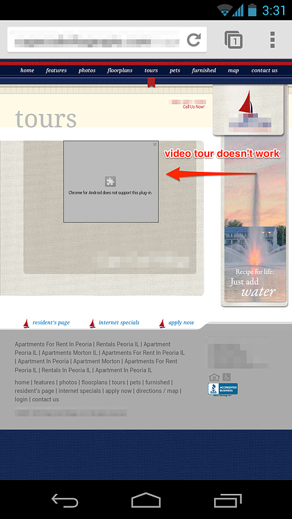
In this case, you'll need to do a limited redesign of your site in order to eliminate the Flash elements and replace them with HTML5 compliant tools that do the same thing. (If your whole site is built in Flash, you will just need to do a full rebuild.) The good news is that very few people are still using Flash, so most webmasters should not run into this problem.
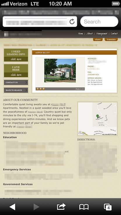
A second problem that often arises is that the community doesn't have a mobile website, so when users on mobile devices go to the site they see the desktop version.
Sites designed for desktop are built for large screens that use a mouse and keyboard to navigate. But mobile devices are touch-based and have a much smaller screen. The menus are difficult to select on a touch screen and the text is small and sometimes illegible. The screen capture below illustrates this problem well:
2) Push-to-Call Button / Calls to Action
Continuing with the theme of making it easy to navigate throughout your site, you want to make it easy for prospects to know the next action they need to take. If someone is on an apartment website, they're likely looking for an apartment.
Make it easy for them to contact your leasing office. The best way to do this on desktop is with a call-to-action—a bit of text or a graphic that tells the prospect what to do next.
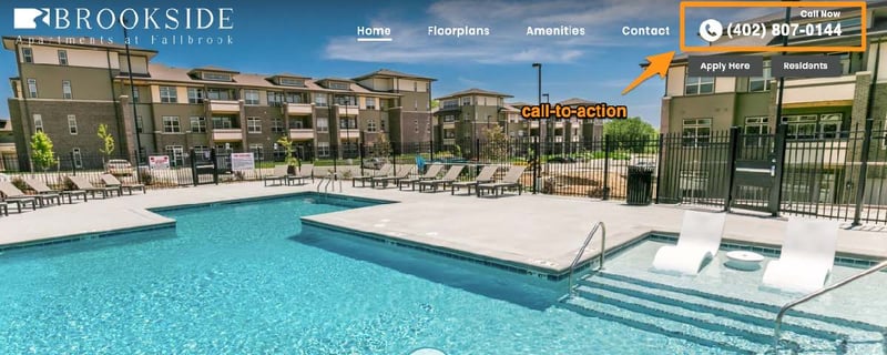
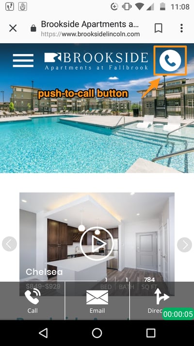
On mobile, you can do one better by using a button, prominently placed on the website, that will call your leasing office when the prospect pushes it. The screen capture below shows one example of how you might do this:
3) Floorplan Landing Pages
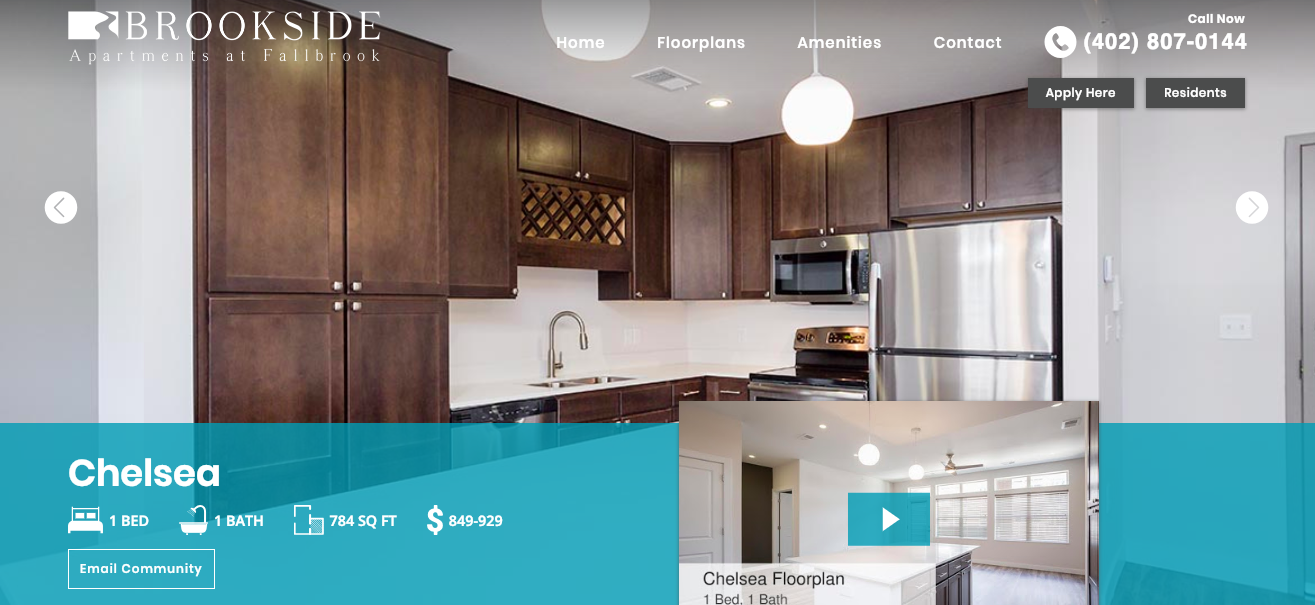
If you think about the products that the multifamily industry is selling, we're not selling communities or amenities primarily, but individual apartments. So we need to organize our websites around our primary product.
Now think about how most apartment websites are built: They're built around the entire community. So, finding specific floorplan information can be quite difficult, even though the floorplan is the thing prospects care about most. In our own testing, around 84% of all website users went to the floorplan page as soon as they arrived on the website.
The best way to serve your customers, then, is by creating floorplan-specific landing pages. On these pages you'll want to include all the things in the image above—videos, photos, amenity information, contact information, and so on.
Your floorplans are your product, so you should make it easy for your prospects to learn about them.
4) Minimal Number of Pages
This point is related to having floorplan-specific landing pages. You need a website that is manageable for users and easy to navigate. You don't want to overwhelm visitors with loads and loads of pages.
You'll want pages for each floorplan, a home page, an amenities page, and maybe an about or contact page. We've seen sites that have an entire page for pet policy or that include all sorts of unnecessary information on the website. So, don't worry about posting a page for each neighborhood attraction, or having all of the move-in paperwork posted on the website. There are better ways of relaying that information to your prospective residents.
In fact, if you offer users too many choices, your prospects can begin to experience something called "analysis paralysis." As described by Barry Schwartz, author of The Paradox of Choice: Why More is Less, analysis paralysis refers to what happens when you are given too many options, worry that you'll choose the wrong one, and so end up not selecting any of them. There are too many choices and psychologically you're more fearful of making the "wrong" choice than you are excited about maybe making the "right" choice.
You can see Schwartz explain the idea in greater detail in his TED talk:
You want your apartment community website to be large enough to do what it needs to do—and no larger.
5) Walkthrough Video Tours
This ties back in with what we discussed regarding floorplan landing pages. An effective commercial website is a site that tells users what they need to know about the website owner's product and makes it easy for them to purchase the product.
What's tricky in the multifamily industry, is that our product is a living space. So, it's not something that can be represented particularly well by words and photos alone. You really need video tours to get the best possible sense of the floorplan. Essentially, you are showing a digital, online version of what they would get if they came to your community. This gives your prospect a comprehensive knowledge of the product and helps them make an educated decision about whether or not to call your community and schedule a tour.
6) Fast Load Time
Page load time is another important factor to consider when designing a user-friendly experience. To test your community site's speed, go to this link to use Google's free tool.
When you're done, Google will generate a report that looks like this and includes recommendations on how to improve your page:
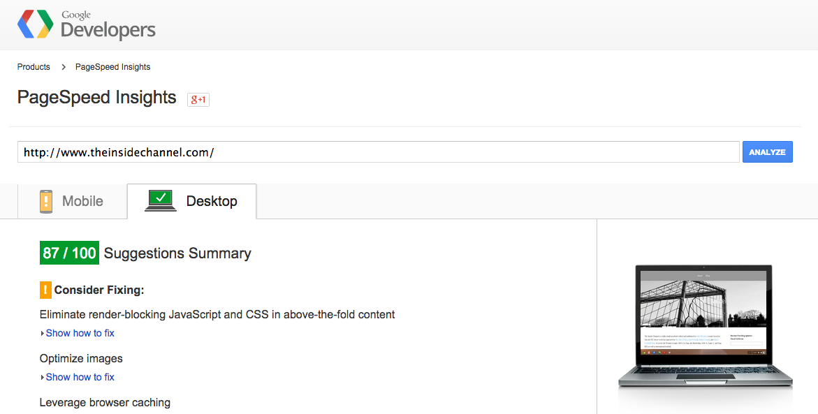
Some of the basic issues that often arise are discussed in this Moz post. If your website is slower, you're likely hurting your presence on Google and possibly antagonizing or losing website users, before they even have the chance to see your community.
Conclusion
The best way to think about user experience on apartment websites is to see it as your first chance to offer high-quality service to your future residents. Just as you want to treat your residents well, you want to treat your online visitors well too. And the best way to do that is with a well-designed, useful website that helps them learn about your community.

